
Soy Food Rebranding & Packaging Design
Smile for you Topsoya
design solution
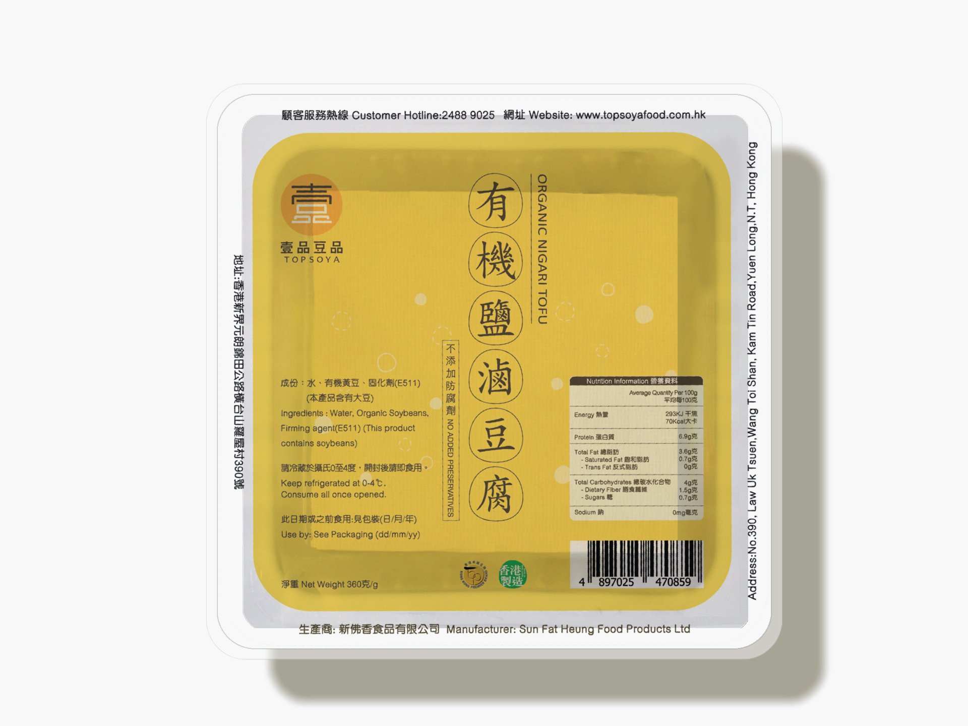
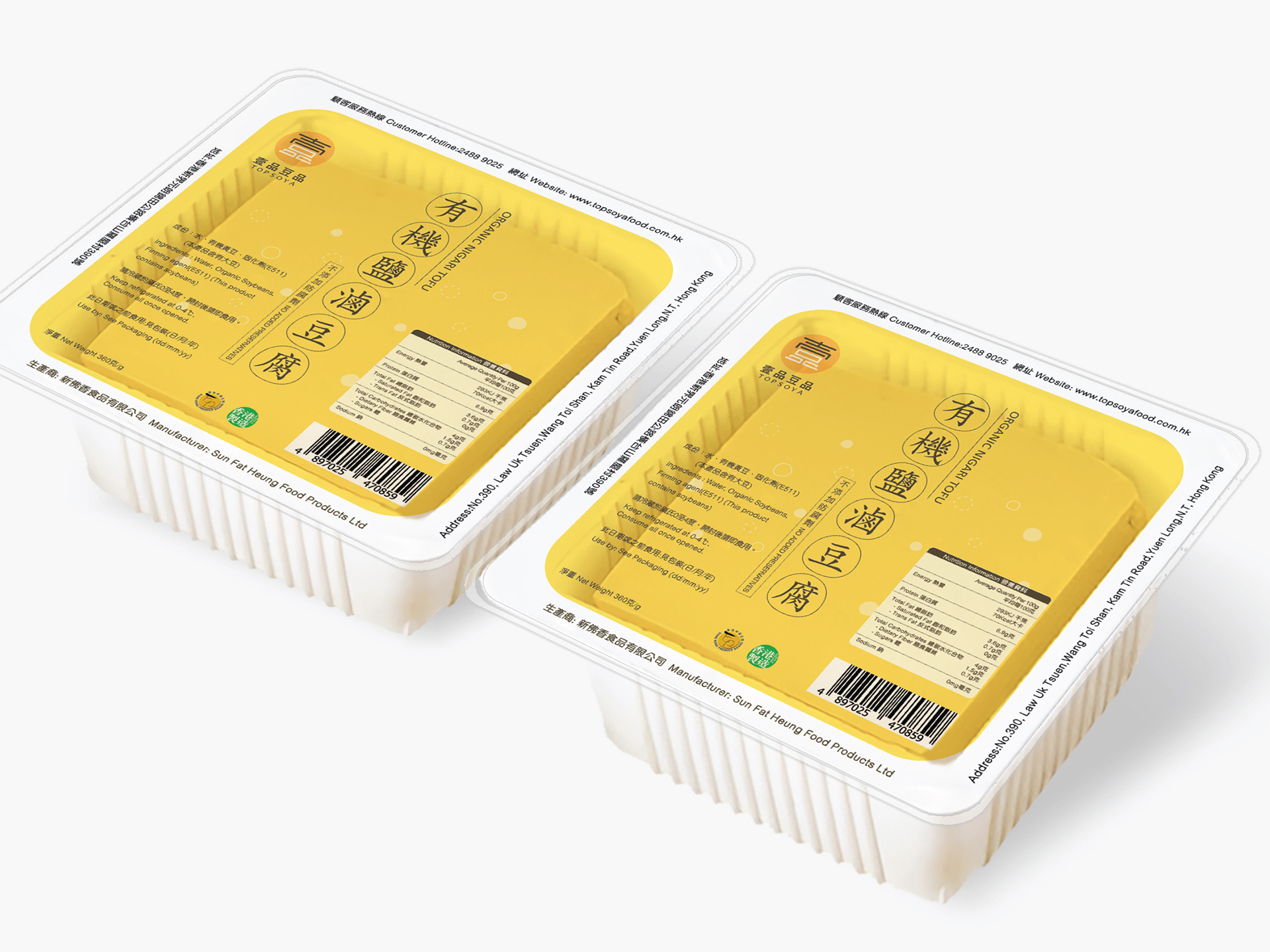
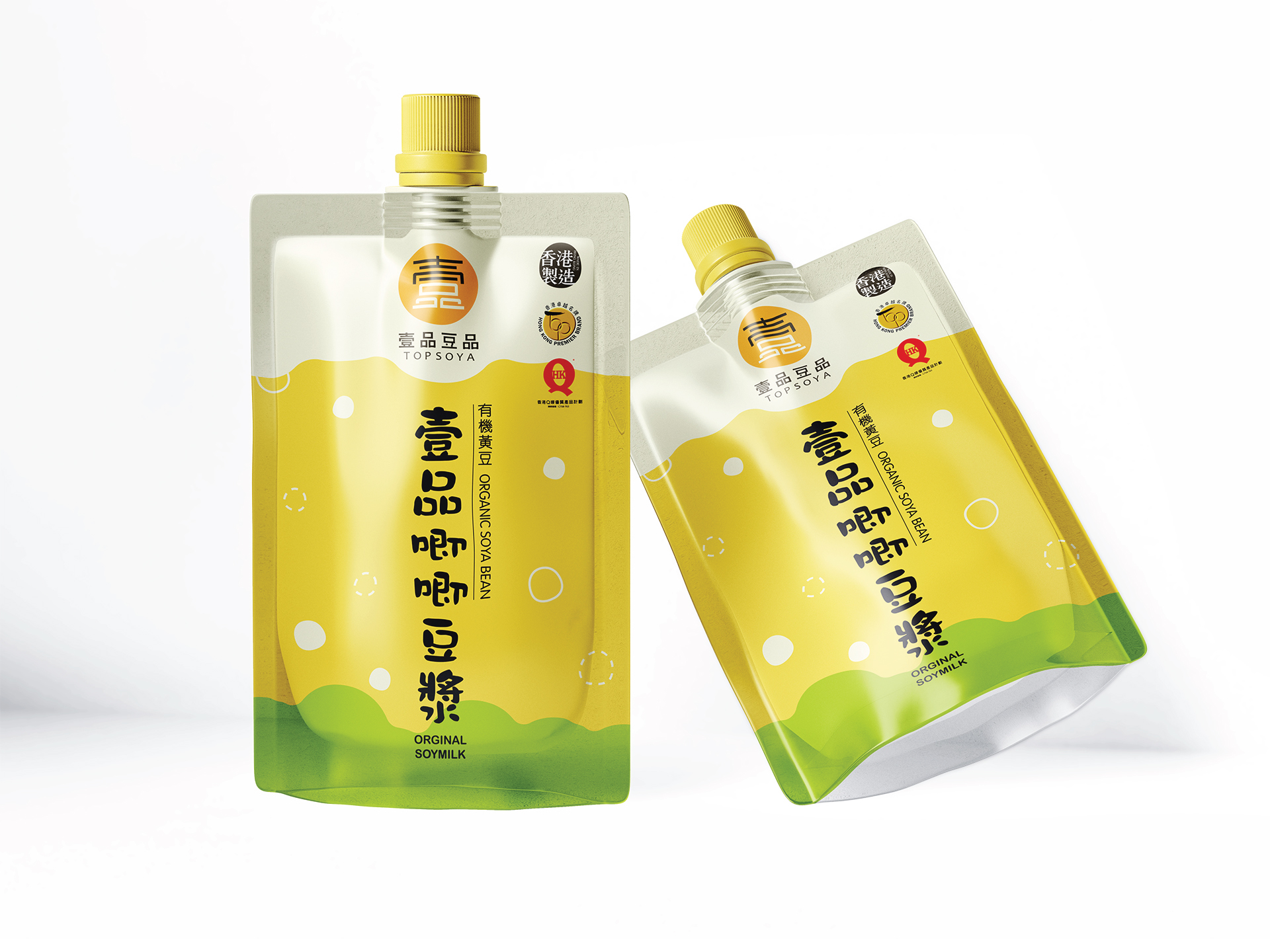
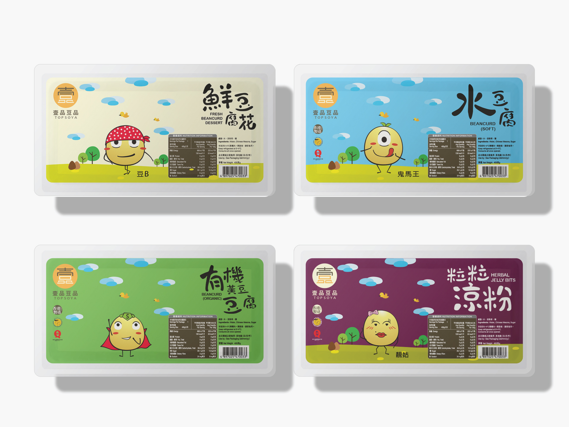
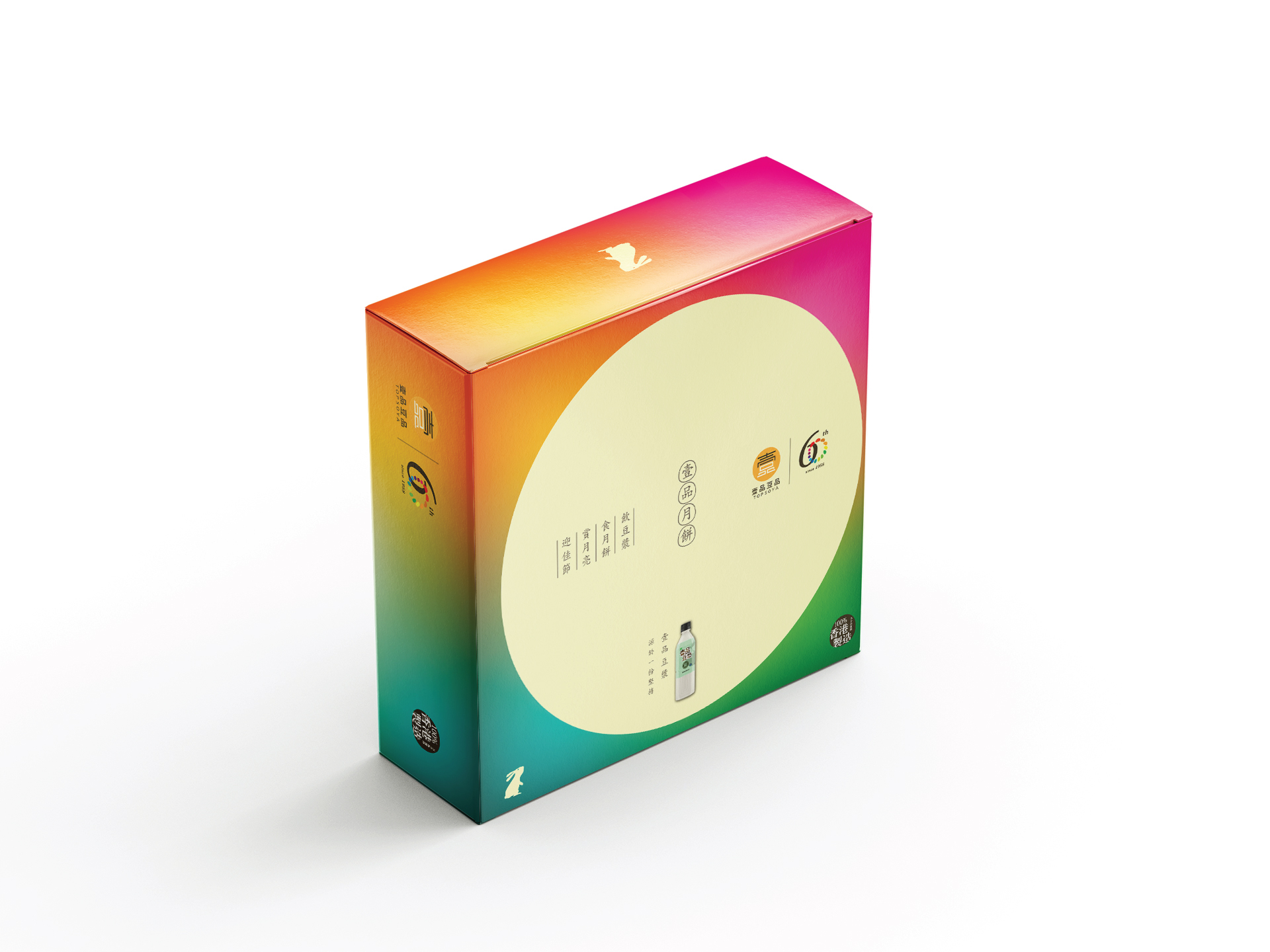
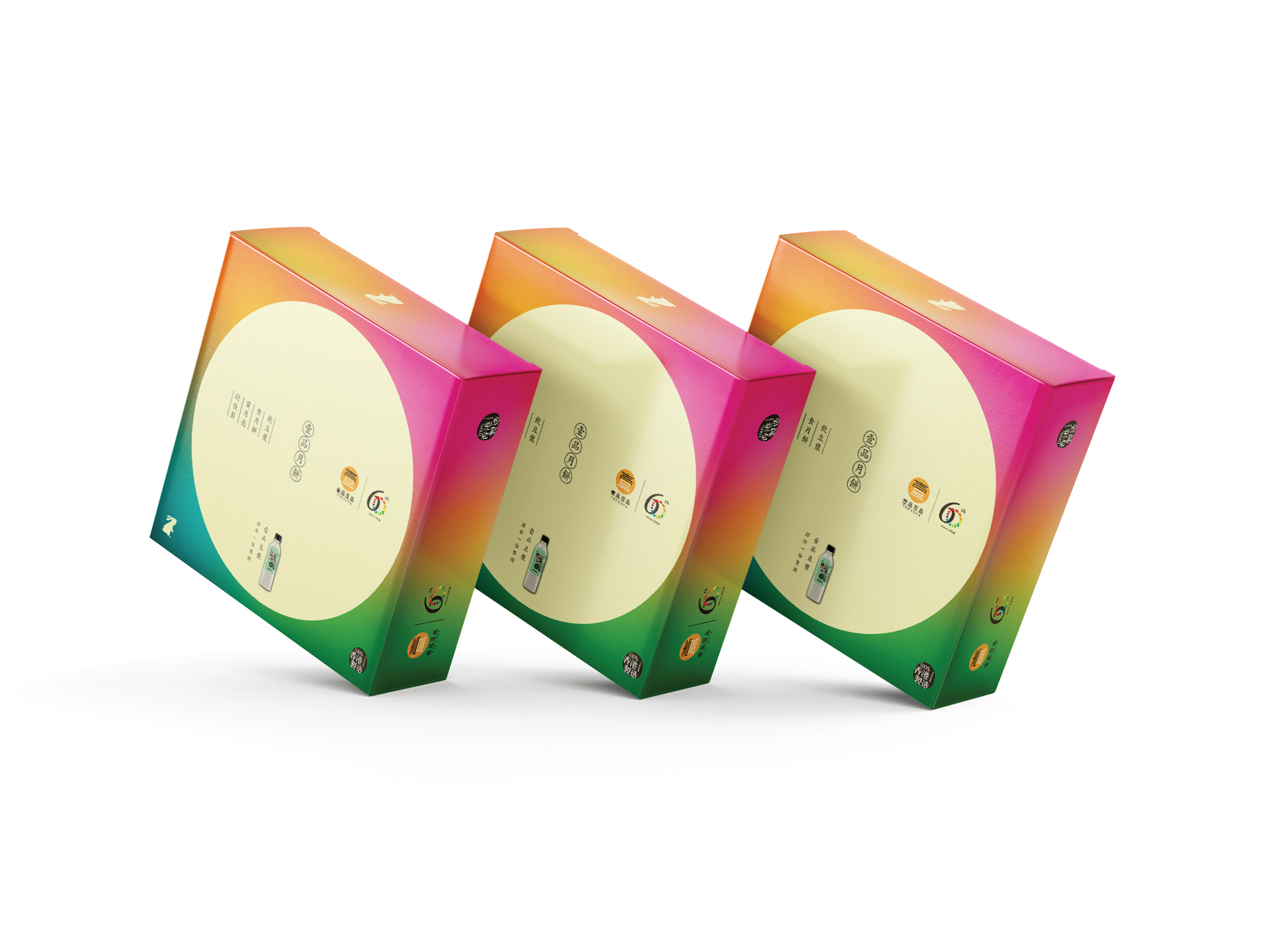
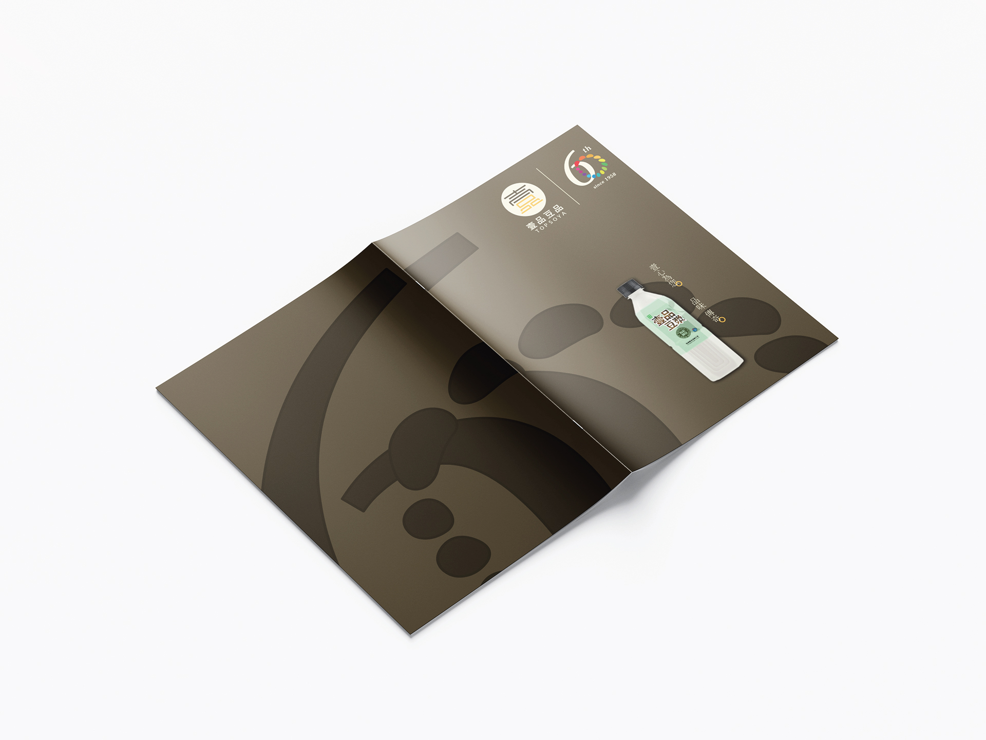
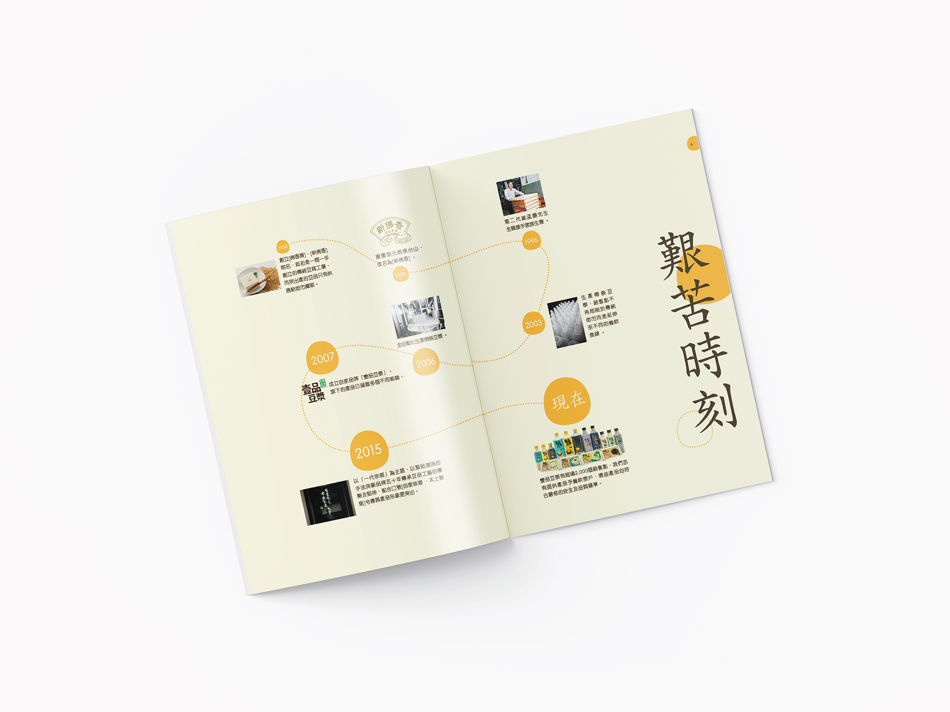
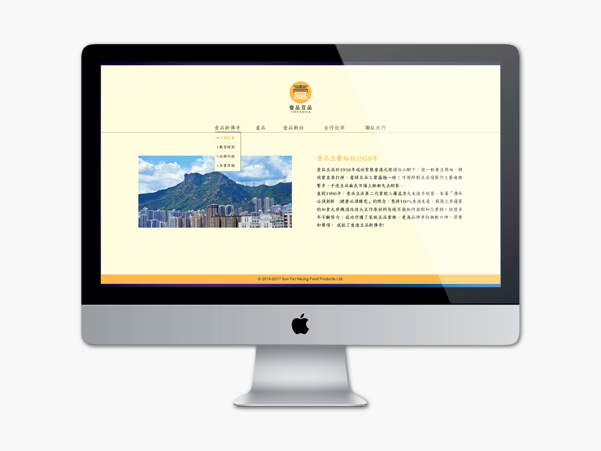
Topsoya is the top soybean product brand in Hong Kong. It has entered its 60th anniversary, this is good timing for rebranding, bringing the brand entrance to the next milestone, close to market changes and trends for preparing an online store. So redesigning the logo and visual identity, the new brand image is focusing on a new generation of young people. This complete system is full of emotion and vitality.
The new logo concept is combined with two words of the brand name, it’s clear and easier to read and modern, the colour palette is light yellow as soymilk, and bright yellow as a spotlight means to focus on quality soy products, building a healthy and happy life.
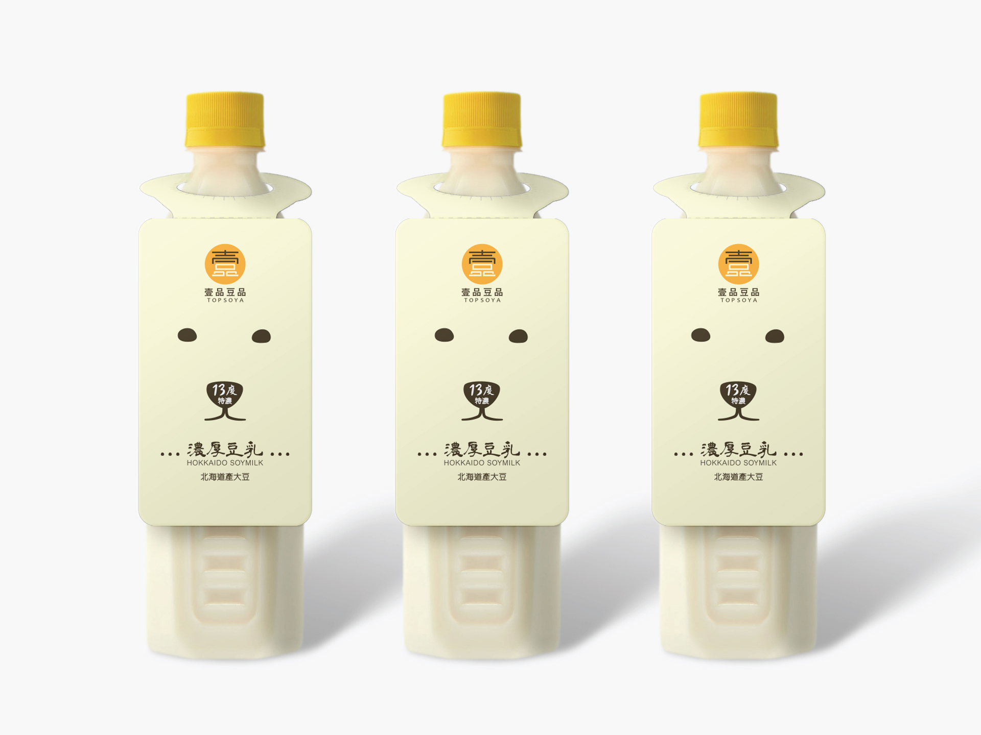
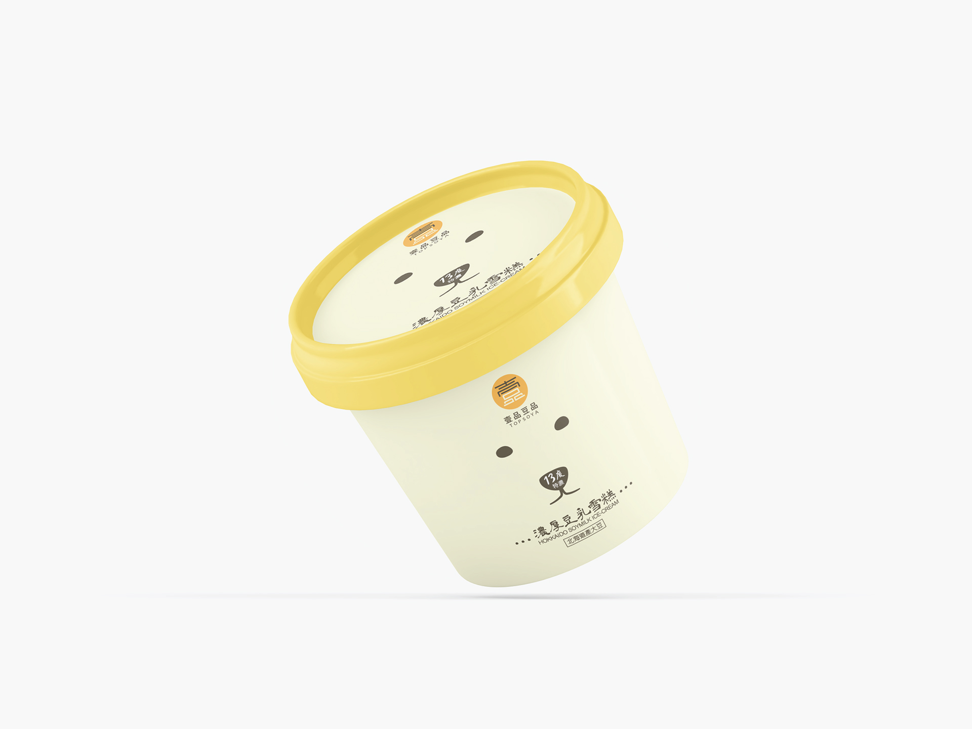
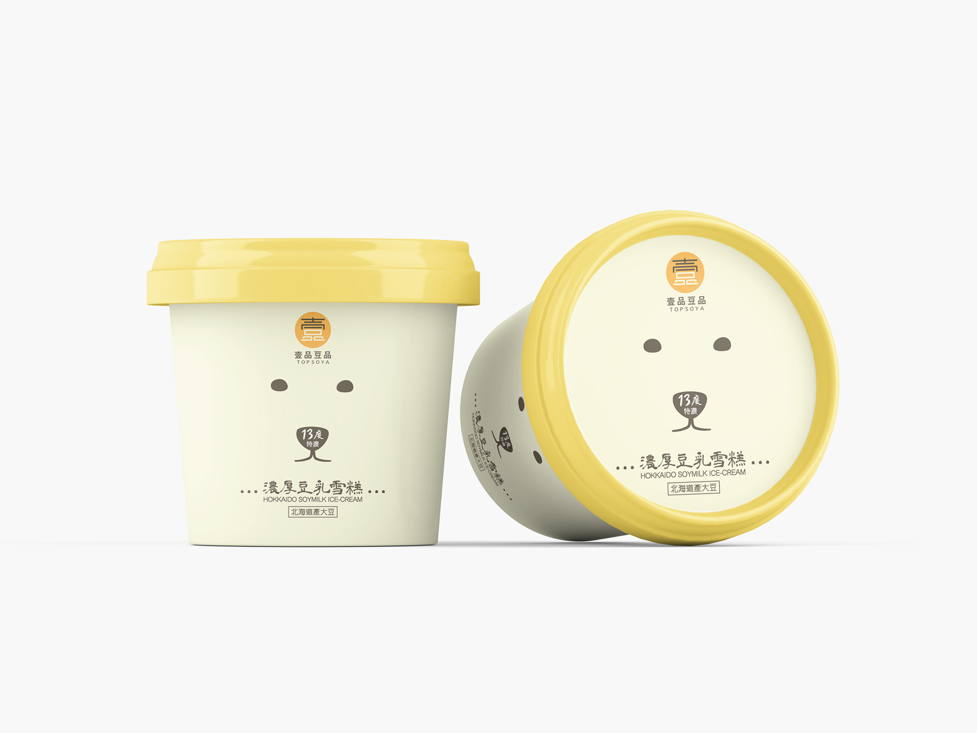
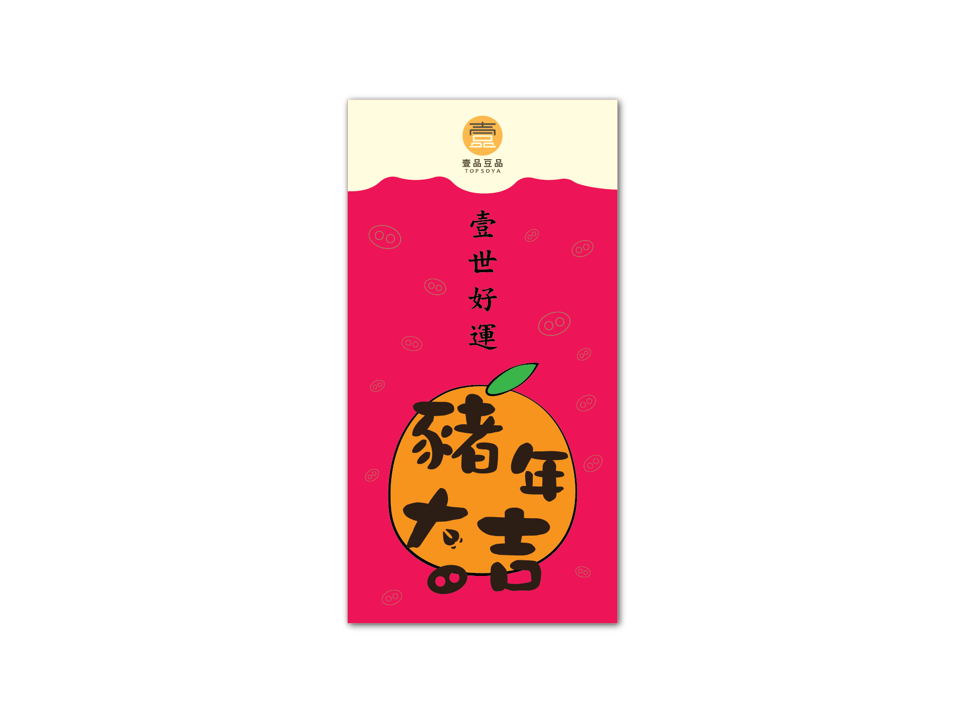
Brand story, visual identity, characters, illustrations and creative copywriting, etc, are used to strengthen the brand image.
client
Topsoya
project by
Maxi Communications
direction
Charles Ng
creative / design / illustration
Mr Kwan
copywriting
Elsie Pang and Mr Kwan
